Title
Esker’s Logo Refresh: A Contemporary Evolution, Not a Revolution
Logos aren’t meant to last forever. The average lifespan of a logo is 10 to 15 years, and ours — excluding a colour change — had remained unchanged since 2007. Over time, while our graphic style evolved, the logo stayed the same, creating inconsistencies in our brand identity. It was time for a refresh.
![]()
But let’s be clear: this isn’t a revolution. It’s a subtle, thoughtful evolution designed to modernise our image while staying true to our identity. Our goal iso remain relevant in our new markets and stay competitive, all while ensuring our brand is as impactful as ever.
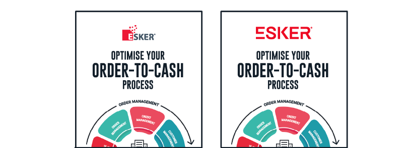
One complication of Esker’s previous logo was its vertical structure. In an era dominated by digital media and mobile-first interactions, a tall logo became a limitation. It often required us to shrink its size, leading to reduced visibility compared to our competitors. Too much valuable space was lost just to maintain readability.
“We needed a more adaptable, versatile design — one that could thrive across different platforms, from social media to mobile interfaces, without sacrificing legibility or impact.”
Delphine Colom, Creative Director
![]()
A wordmark logo — where the company name itself is the logo — was the obvious choice for us.
Here’s why:
- Simplicity & clarity: Easy to read, instantly recognisable
- Memorability: Focus on the name, increasing brand recall
- Flexibility: Scales effortlessly across all formats and sizes
- Timelessness: Avoids fleeting design trends and ensures longevity
- Universality: Works across languages and cultures without misinterpretation
- Expertise: A clean, refined look that aligns with our brand
This refined logo isn’t just about aesthetics—it’s about strengthening Esker’s brand presence in a digital-first world. By optimising the visual identity for modern media while maintaining its core essence, we’re ensuring that our brand remains strong, recognisable and ready for the future.
“Esker’s evolution continues and so does its brand. As we unveil the new logo, we are presenting a symbol of innovation, agility and our commitment to shaping the future. More than just a design, it’s a reflection of who we are and where we’re headed. Welcome to the next chapter.”
Eric Bussy, Vice President Marketing & Product Management
Welcome to the new era of Esker — modern, dynamic and built to last.
Author Bio
Esker UK
The AI authority for smarter business process automation. Esker enables the Office of the CFO to optimise working capital and cashflow management, improve decision-making, and achieve better business outcomes through secure and strategic AI technologies.
- Log in to post comments